CHAPTER 01
A hundred meters east
The line at Greenwich is in the wrong place for your phone. Stand on the historic meridian at the Royal Observatory and a modern satellite position puts you a little west of zero longitude. The difference is about 5.3 seconds of arc. The modern zero lies roughly 102 meters east.
There is a satisfying but incorrect explanation available: the continents moved. They do move, but that does not account for this distance. A 2015 study by Stephen Malys and colleagues traces the discrepancy to the different ways astronomical and modern geodetic coordinates establish their reference. The local direction of gravity mattered to the old observations. The newer Earth-centered system had to preserve continuity with the existing measurement of Earth's rotation. A change in the kind of measurement left two useful lines on the ground. The geodetic study
The old line passes through the Airy Transit Circle. Its first observation was made on January 4, 1851. A transit instrument watches stars cross a particular plane, and accurate timing turns those crossings into measurements. It does not survey the globe by receiving signals from orbit. Royal Museums Greenwich on the instrument
This is an awkward opening for a book about maps because neither a broken phone nor a foolish museum supplies the villain. The instrument, the marked line and the coordinate system each have a history. The apparent contradiction is what happens when we omit those histories and retain only a number.
Imagine two drawings of your kitchen. On the first, the bottom-left corner of the room is the origin. On the second, the center of the table is the origin. The sink receives different coordinates. Moving from one drawing to the other does not require moving the plumbing.
That is only a translation between two homemade plans, much simpler than the Greenwich problem. It does establish one habit worth keeping: before blaming a coordinate, find out what it is measured from. A number with six decimal places can be exquisitely precise about the wrong reference.
A similar confusion appears when someone screenshots a map, removes its scale and sends it to a friend. The drawing still looks complete. Streets have names; the river keeps its bends. Yet one of the instructions for reading the geometry has gone. We supply a distance from familiarity, often without noticing that we have supplied anything.
The chapters ahead use a few famous maps and several small, invented examples. There are no reconstructed conversations in the survey office, and no account of a journey the author did not make. When a town or survey is invented, its numbers are available to inspect. When an old map appears, its date and source travel with it.
You can begin without knowing any cartography. Find a familiar place on a world map, cover its name, and turn the page upside down. The coastline has not changed. Recognition may take an extra second. That second is useful: it gives you time to catch a learned arrangement masquerading as a property of the Earth.
CHAPTER 02
Sicily beneath Africa
On the map below, Africa occupies much of the upper part of the sheet. Europe lies below it. The Mediterranean is recognizable once you stop looking for it in its customary position. Sicily has not drifted through the sea. South is at the top.
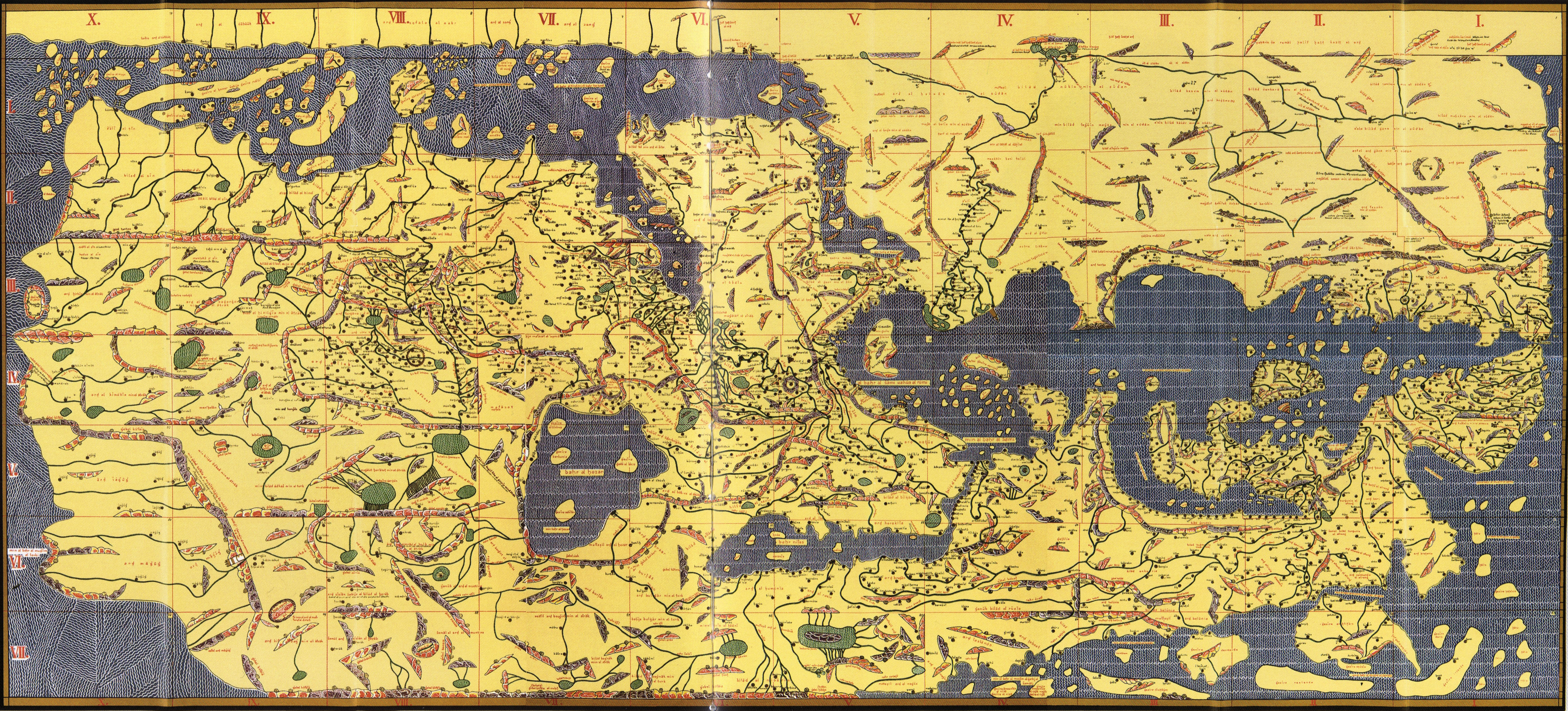
Konrad Miller's reconstruction, from the late 1920s, of the geography associated with al-Idrisi's 1154 work. This is a modern reconstruction with transliterated names, not a photograph of the original twelfth-century manuscript. Public domain; Wikimedia Commons.
Al-Idrisi prepared his geographical work for Roger II of Sicily. Completed in 1154, it combined text with seventy regional sections, drawing on earlier geographical writing and travelers' information. The Library of Congress describes the commission and the later assembly of its maps by Konrad Miller. A reproduction can be separated from the original by hundreds of years and still arrive online with only the original date attached. The Library of Congress account
Look at the image before enlarging it. The grid is almost as conspicuous as the geography. Then enlarge it and follow a coast across a dividing line. A reader interested in a particular region can treat a section as a page; a reader interested in the larger arrangement needs to connect sections. The sheet has two scales of attention built into its construction.
Turning it around will help a modern reader recognize Europe. It will also put the lettering upside down. That small inconvenience is evidence of an intended reading position. The writing was arranged for someone whose upper edge was different from ours.
Cartographer Aileen Buckley discussed a map of the San Diego Convention Center with the entrance toward the bottom, so that someone entering could read onward into the building. True north pointed toward the lower right. The arrangement prompted an objection from a reader expecting north above. Buckley's explanation
Try drawing the ground floor of your home for someone who has just opened the front door. Begin with that person at the bottom. Put the first turn where it will occur in their view. Now redraw the same rooms with north above. If the entrance faces an inconvenient direction, the second plan will require a mental rotation before it helps with the first turn.
Neither plan has to be more accurate in its measured dimensions. Their difference lies in which work the reader must do. A north-oriented plan makes comparison with a street map easier. An entrance-oriented plan may make the next thirty seconds inside a building easier. A good drawing can state its orientation and let its task determine the page.
On Miller's sheet, follow a name as well as a coastline. Rotating the geography helps recognition; reading the name brings you back to the compilation itself. Someone chose how to transcribe it, where to place it, and which older account to follow. The arrangement of the page is only the first of those decisions you can see.
CHAPTER 03
The square at sixty degrees
Take a small square on a spherical Earth at the equator. Give it a neighbor of the same ground area at sixty degrees north. On an ordinary Mercator world map, the northern square occupies about four times as much paper.
The word small matters. This is a statement about local scale. A country extending across many latitudes experiences different scale factors within its own outline. It does not receive one uniform enlargement that can be undone by shrinking the whole country like a photograph.
Mercator's spherical formula makes the change inspectable. Horizontal position is proportional to longitude. Vertical position grows as the inverse hyperbolic sine of the tangent of latitude. The unfamiliar name of that function can wait; its effect is visible in the increasing space between parallels as they approach a pole. PROJ's Mercator equations
At latitude sixty degrees, the cosine is one-half. Mercator's local linear scale, relative to its equator, is the reciprocal: two. A tiny east-west distance becomes twice as long on the page as its equatorial equivalent. A tiny north-south distance also becomes twice as long. Multiply the two and the area factor is four.
At eighty degrees the linear factor is about 5.76. The area factor is about 33.16. Farther toward ninety degrees, both grow without a finite upper limit. You cannot finish a Mercator rectangle by adding a final neat line for the pole. A world view using this projection has to stop short of it.
Here is a paper version of the calculation. Draw a one-centimeter square. Beside it draw a two-centimeter square. The second looks modestly enlarged until you divide it into four copies of the first. Area has responded to both directions at once. This is why a statement about length distortion cannot be casually reused as a statement about the amount of land.
The same multiplication explains another property. Because the two local directions stretch equally, tiny intersecting lines keep their angle. A small enough circle remains locally circular. Cartographers call this conformality. It does not mean that the map preserves the overall shape of every enormous region. Nor does it mean that measuring a straight line anywhere on the page gives ground distance using one universal ruler.
A projection can be good at one geometric job while being bad at another. Mercator makes constant-bearing paths straight. That property gave the design a navigational purpose. If we use the same page to compare the areas of continents, we are asking it to do a different job without changing its rules.
There is no need to assign a secret motive to every oversized northern landmass. The enlargement follows from the formula. Decisions still enter when someone chooses that formula for a classroom wall, crops it at a particular latitude or places one region in the center. Those choices are easier to discuss once the mathematical effect has been separated from claims about what the mapmaker intended.
In the experiment ahead, you will be able to switch the rules while keeping the coastline data fixed. The northern circle will shrink. No coastline will have to be redrawn by hand.
CHAPTER 04
A straight line with a longer journey
Put two imaginary harbors at fifty degrees north, one at forty-five degrees west and the other at forty-five degrees east. Leave weather, currents, land and shipping lanes out of this exercise. We are comparing paths on a sphere with radius 6,371 kilometers.
One route follows the fiftieth parallel due east. The longitude change is ninety degrees, one-quarter of a complete turn. The circle at that latitude has radius equal to the Earth's radius multiplied by the cosine of fifty degrees. Its quarter-circumference is about 6,433 kilometers.
The shorter great-circle route between the same endpoints is about 6,012 kilometers. It bends northward when drawn on the usual Mercator page. It is shorter by roughly 421 kilometers even though the printed route looks less direct. These are calculated teaching distances, rounded to whole kilometers; they are not a proposed voyage between actual ports.
A globe makes the comparison less troublesome. Stretch a thread between the two points, keeping it against the surface along the shorter route. The thread moves north of the parallel. A rubber band is an imperfect surveying instrument, but it can correct a visual intuition acquired from flat rectangles.
On a sphere, a great circle lies in a plane through the sphere's center. The equator is one; a complete meridian is another. Most latitude circles are smaller circles whose planes miss the center. Following one keeps your latitude constant, but it does not generally give the shortest route between two of its points.
For two non-antipodal points on the sphere, the shorter great-circle arc supplies the shortest surface path. The corresponding calculations on a flattened Earth use geodesics on an ellipsoid. GeographicLib documents those problems and distinguishes finding an endpoint from an initial direction and distance from finding the route between known endpoints. GeographicLib's explanation
Our spherical example can be checked without drawing a route. With both latitudes equal to fifty degrees and the longitude difference ninety degrees, the cosine of the central angle is the square of the sine of fifty degrees. Take the inverse cosine, in radians, and multiply by the chosen radius. The workbench includes the calculation so a misplaced degree-to-radian conversion cannot hide behind the illustration.
Now change the question. Suppose your instruction is to maintain a constant compass direction relative to true north, rather than continually alter the bearing to follow the shortest spherical route. That is a rhumb-line question. Except in special cases such as a meridian or the equator, it is a different path. Mercator's straightness is useful precisely because it represents that different condition.
A route acquires constraints long before it reaches a display: a channel, a bridge, a border crossing, a departure time, a road surface. A geometric minimum answers only the question put into its calculation.
For these two harbors, the curved line is shorter. The straight line keeps the bearing.
CHAPTER 05
Three blue circles
Open the map room. There are three blue outlines on the world: one around the equator, one around sixty degrees north and one around sixty degrees south. On the globe they enclose equal areas. Each boundary lies six angular degrees from its center.
The opening view uses Mercator. The northern outline occupies about 4.07 times the mapped area of the equatorial one. You might expect exactly four after the previous calculation. The discrepancy is intentional. These circles have a finite radius and cover a range of latitudes. The fourfold factor describes an infinitesimal neighborhood at exactly sixty degrees; our measurement adds up a whole patch.
Choose Equal Earth. The ratio becomes 1.00. Choose Lambert cylindrical equal-area. It remains 1.00, though the outlines acquire quite different shapes. The three maps below show the same comparison for readers using the downloaded edition.
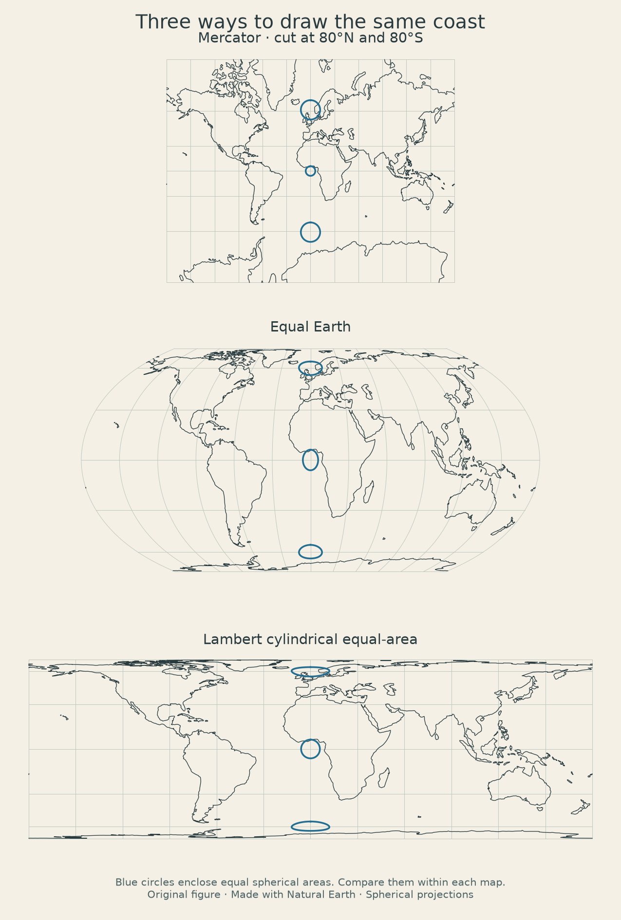
Original spherical calculations and drawing. Coastlines: Natural Earth, public domain. Compare the blue patches within each panel; the panels are fitted separately to the available space.
The display gives you two more controls. Center longitude moves the world through its frame. South at the top rotates the complete drawing by half a turn. It does not mirror the continents. If you choose a center in the Pacific, the blue patches follow that central meridian so that all three remain visible. They are measuring devices, not fixed research sites.
Try changing only one control at a time. Begin with Mercator at zero longitude, north above. Switch to Equal Earth and leave everything else alone. Then keep Equal Earth and move the center. Finally rotate it. This sequence separates three decisions that a finished map usually presents as a single style.
The coastline is an outline with no countries, cities or names. Adding those layers would introduce other questions: which borders, which languages, which settlements survive the reduction to a phone screen? For this experiment, the missing labels keep the geometry visible. You can still recognize enough of the world to feel it become unfamiliar when the center moves.
Under the drawing, the area ratio is also written as text. Color does not carry the numerical result by itself. The downloadable code includes the circle construction, projection equations, coastline and checks. You can run the calculation without accepting a screenshot as evidence.
The model uses a sphere, and the coastline is highly simplified. It is suitable for comparing the stated projection rules. It is not a navigation chart or a survey of an inlet. Zooming your browser will make the strokes larger without adding a single geographical observation.
Spend a moment with the Lambert view. The northern patch has the right relative area and looks flattened. The enlargement is gone, but the circle has flattened. Change the setting again and watch where the stretching goes.
CHAPTER 06
A projection made in 2018
Equal Earth has a recent birthday. Bojan Šavrič, Tom Patterson and Bernhard Jenny introduced it in 2018. Their paper describes an equal-area world projection with an appearance influenced by Robinson, a familiar projection that does not itself preserve area. They wanted an alternative to the elongated forms associated with Gall–Peters. The authors' paper
A map can look calm, balanced and geographically reasonable while failing an area test. Another can pass the test and look unfamiliar. Equal Earth's designers worked on both the mathematical condition and the visual result. Neither task automatically completed the other.
In the map room, its meridians curve away from the central line. The parallels remain horizontal. The poles become finite lines along the upper and lower edges. Those are visible consequences of its chosen geometry. They also give labels and surrounding page furniture a different amount of room than a rectangular Mercator view would.
To understand equal area, return to a very small patch on the globe. Near the equator, one degree of longitude spans a wider ground distance than it does near a pole. Latitude and longitude are angular coordinates; a degree square does not have a constant area everywhere. A projection cannot preserve ground area merely by assigning the same paper square to every degree square.
On a sphere, the area of a tiny longitude-latitude patch contains a cosine-of-latitude factor. An equal-area projection must reproduce that factor in the way its two output coordinates spread apart. In the workbench, a numerical check perturbs longitude and latitude separately and measures the resulting little parallelogram. The calculation checks area locally before the larger circles are compared.
A picture of a familiar coastline can look plausible even when a coefficient is wrong. A program can accidentally swap two terms and still produce something roughly oval. Numerical comparisons with an independent implementation are better at finding such errors than recognition alone.
The workbench compares 1,887 coordinate pairs with PROJ, an established cartographic library. It also checks local area behavior at 105 combinations of location and projection. Those tests cover the implementation used here; they do not certify that a person choosing this map has selected the right data or asked a sensible question. PROJ's Equal Earth documentation
Suppose a report compares crop areas across countries. An equal-area base makes the visual amount of country on the page less misleading, but it does not turn every country into cropland. A large pale polygon may contain a small cultivated region. If the data concern hectares harvested, the map still needs a symbol or color scheme that expresses those hectares.
For that crop report, ask to see the hectares as well as the base map. Compare two countries with similar areas and different cultivated fractions. The equal-area projection can keep their outlines proportional while their harvests remain very different.
CHAPTER 07
Where the page comes apart
A coastline crosses from 170 degrees east to 170 degrees west. Its longitude labels differ by 340 degrees if you subtract them as ordinary numbers. The short crossing around the back of the usual world map is twenty degrees.
A drawing program that forgets the wrap can connect the points by a line across almost the whole page. The result looks like a long artificial coast through the middle of the world. This is a small software error with a very large visible signature.
The map room handles the crossing by cutting the segment at the edge of its chosen longitude interval. In a simple example, a line from 170°E, 0° to 170°W, 10° is split into two pieces. One reaches the right edge at latitude 5°; the other resumes at the left edge at the same latitude. The interpolation here is linear in the supplied longitude-latitude coordinates. It is a way of drawing the simplified data, not a claim that the coastline between observations follows an exact geodesic.
Move the center longitude to 150°E. The cut moves to the opposite meridian, 30°W. The Pacific becomes continuous across the middle of the drawing. Something else has to cross the new seam. No coast is physically more continuous than it was before, but your eye no longer has to join the Pacific across two margins.
A globe can be turned in the hand without acquiring an edge. A flat rectangular world map needs a way to open that loop. The place where it opens affects which connections look immediate and which require the reader to leave one side and return at the other.
This becomes consequential when lines are added. Imagine a map of undersea cables centered on the Atlantic and another centered on the Pacific. Both can contain identical cable coordinates. In one, a particular connection appears as a continuous stroke; in the other it appears in pieces. A reader scanning quickly may count the pieces as separate things unless the design makes the continuation clear.
The seam in this experiment is a geometrical cut. It should not be confused with the civil boundary where calendar dates change. Timekeeping arrangements involve political decisions and islands as well as longitude. The center slider does not move anyone into tomorrow.
There is a related trap at the endpoints of a numerical interval. Positive 180 degrees and negative 180 degrees name the same meridian. A data table can validly encounter both representations. If software treats them as distant locations, it can produce spurious bounding boxes, overlong routes or a map that zooms out unnecessarily.
Try writing the crossing on paper as a short number sequence: 170, 175, 180, 185, 190. Then write the last two values as −175 and −170. The positions have not changed. Only the convention for displaying the labels has wrapped around. This is a useful exercise for programmers because the error often begins before any canvas or map library appears.
When the map room cuts a line, it keeps both pieces. An edge is a printing decision. Losing the second piece would turn that decision into missing geography.
CHAPTER 08
An island smaller than the pen
At a scale of 1:110 million, one millimeter on the drawing represents 110 kilometers on the ground. That is the scale associated with the small Natural Earth coastline dataset used in the map room. It is meant for broad views of the world. Natural Earth's coastline description
Imagine an island five kilometers across. At that scale its width would be about 0.045 millimeters. A useful printed outline cannot simply reproduce its measured edge at full proportional fidelity. The mapmaker has to omit it, exaggerate it or supply another kind of symbol. Each option changes the visible drawing in a different way.
Our downloaded dataset contains 134 line features and 5,128 coordinate pairs. Those counts describe the structure of this particular file. They are not a count of the world's islands, coast segments or surveyed positions. One feature can contain many vertices, and the decisions that reduced the source geography have already happened before the browser receives it.
The exact version is preserved in the workbench. The file comes from a pinned revision of the Natural Earth repository, so a later update will not silently change the coastline behind the published figure. Natural Earth releases its map data into the public domain. Data terms
There is an easy experiment to perform with any detailed drawing of a shore. Reduce it until adjacent bends merge. Enlarge the reduced version again. The lost distinctions do not return. A display can give you more pixels while the underlying line still has the same small set of turning points.
At a larger map scale, different objects become feasible. On a 1:24,000 sheet, one inch represents 2,000 feet. A line drawn 0.2 millimeters wide spans 4.8 meters in ground units. A road symbol can therefore be wider than the measured feature it represents, especially when outlines, casings or adjacent symbols are added. A symbol's visual width is not automatically a road-width measurement. USGS map symbol guide
Cartographic scale has an irritating vocabulary. A larger-scale map shows a smaller area in greater detail: 1:24,000 is a larger fraction than 1:110,000,000. People often say “large map” when they mean a map covering a large territory. The printed ratio resolves the ambiguity more reliably than the adjective.
Reduction affects names as well as geometry. If every settlement retains its label, the names begin to collide. Choosing which survive can depend on population, administrative role, relevance to the subject or available space. The absence of a label does not establish that a place is unimportant to the people who live there.
In the experiment, the coastlines are unlabelled. That avoids a crowded phone screen, but it also gives a reader less help locating an unfamiliar region. There is a cost to the clean appearance. Minimal design still makes choices about who can recognize what without assistance.
If you need a harbor entrance, leave this world view. The right next step is a more suitable source, not another gesture to enlarge the same 5,128 points.
CHAPTER 09
Two numbers in the wrong order
Write this pair on a scrap of paper: 12, 48. Without labels, it does not tell you which number is latitude. Both values fall within the legal range for either coordinate. Swap them and you obtain a different place, but no obvious numerical error.
The GeoJSON format specifies longitude before latitude. A position can include height as a third value. That order is documented in the format rather than left for a program to infer from the values. RFC 7946
People often speak of “latitude and longitude” in the opposite order. Copying from a familiar-looking form into a data array can therefore send a point somewhere else while preserving every digit. The example is especially treacherous because both versions are valid positions. A check that merely rejects latitude beyond ninety degrees will accept them both.
A stronger check asks whether the point belongs in the expected region. If you are importing a local tree inventory, a point on another continent is a useful failure even though it is mathematically valid. If you are importing a worldwide inventory, that same test needs a different expectation. Validation depends partly on what the dataset is supposed to contain.
Now add decimal places: 12.000000, 48.000000. The extra zeros make the pair look more authoritative without resolving the order. Nor do they establish how accurately the point was observed. A number can be stored to a much finer increment than the instrument or method can support.
Suppose someone estimates a tree's position from a small printed plan and later types it into software that saves six decimal places. The saved value has acquired formatting precision, not six-decimal-place field knowledge. A map popup that displays the whole string can conceal the roughness of the original observation.
There are several separate questions to keep with a coordinate: which axis is which, which units are used, what reference system is intended, and how the position was obtained. A local building plan measured in meters can legitimately contain numbers that would be impossible as angular latitude. Rejecting it as bad longitude would diagnose the wrong problem.
For a small practical exercise, make a table with three rows labelled front door, kitchen window and garden gate. Give each an eastward and northward distance from the same chosen corner of a page. Then exchange the columns without exchanging their labels. Plot both versions. One set may still resemble a plausible arrangement of a building; plausibility alone will not recover the intended positions.
Next write the origin and units above the table. Have another person plot it without seeing your drawing. Any question they have is information the table failed to carry. This is a cheap way to discover what a coordinate export needs before the export contains a million rows.
The map room's downloaded coastline keeps its declared coordinate order. Its small JavaScript model receives longitude first throughout. The file, functions and tests use the same order. An imported point can be followed through the program without its two numbers exchanging jobs.
CHAPTER 10
Above which zero?
An imagined receiver reports a height of 84 meters. A nearby benchmark in the same exercise is labelled 115 meters. Before deciding that one is wrong by thirty-one meters, ask what each height measures above.
Satellite positioning can provide an ellipsoidal height: a distance relative to a smooth mathematical model of Earth's shape. An orthometric height uses a gravity-related level surface, the geoid, as its reference. Dennis Milbert and Dru Smith explain the relationship in a National Geodetic Survey paper on height conversion. With compatible references, the usual relation is h = H + N: ellipsoidal height equals orthometric height plus geoid height. The NGS paper
Give our fictional site a geoid height of −31 meters. Subtracting that negative value from 84 produces an orthometric height of 115. The two labels can now describe the same point. These numbers illustrate the algebra; they are not values for a named location or a conversion to use in a field survey.
The condition about compatible references matters. The NGS paper explains that practical datums can introduce offsets, and its particular historical model was built to connect particular height systems. Taking an arbitrary correction from one system and applying it to a height from another does not become valid because the subtraction is easy.
A household analogy helps only partway. If a shelf is one meter above the floor and the floor is thirty centimeters above the pavement, the shelf is 1.3 meters above the pavement. You need to know the relationship between the reference levels. Earth's height systems add gravity, measured networks and curved surfaces to that bookkeeping. The analogy explains why a reference is necessary, not how to conduct geodesy.
Consider a map containing flood depths and building heights. A color labelled “two meters” might mean ground elevation above a datum, water depth above local ground, or the height of a threshold above a sidewalk. Those are different quantities. A legend that supplies only a unit has not supplied a definition.
In a made-up building example, let the sidewalk be at elevation 20 meters and the doorstep at 20.4 meters in the same system. Water at elevation 20.2 meters is twenty centimeters above the sidewalk and twenty centimeters below the doorstep. A map of water elevation and a map of water depth would display different numbers for the same scene.
Now imagine the terrain model smooths the doorstep into the surrounding pavement because its cells are too large to resolve the step. The coordinate reference can be correct while the local detail is absent. Correct datum, fine numerical precision and adequate spatial resolution are separate requirements.
For ordinary reading, you do not have to reconstruct a national height network. You can look for the height definition and notice when it is missing. A contour label should tell you more than a number; a scientific map should identify the reference used. If a screenshot has cropped off that information, recovering the original sheet may do more good than enlarging the remaining digits.
CHAPTER 11
Three norths on one sheet
A compass needle gives a direction related to the local magnetic field. A map's vertical grid lines give grid north. The direction along a meridian toward the geographical North Pole gives true north. At a particular place, these directions can differ.
Magnetic declination is the angle between magnetic north and true north. NOAA's explanation makes a point that is easy to miss: a compass aligns with the local magnetic field, not simply with a straight great-circle route to a magnetic pole. The angle also changes with location and time. NOAA on declination
Grid north belongs to the projected coordinate grid. On a map whose meridians curve relative to that grid, the difference from true north varies across the sheet. A drawing with three small arrows near its margin is trying to describe those relationships. Treating all three as decorative versions of one arrow discards the reason they were printed. Ordnance Survey on grid convergence
Here is an angular example. Suppose magnetic north points ten degrees west of true north. Looking toward true north, you would see the compass's north direction ten degrees to the left. A direction twenty degrees east of true north would then be thirty degrees clockwise from magnetic north.
The numbers are easier to trust after drawing the arrows. Put true north at the top of a circle. Mark magnetic north ten degrees counterclockwise from it. Mark the destination twenty degrees clockwise from true north. Count the whole clockwise interval from the magnetic arrow to the destination: thirty degrees. No mnemonic has to survive an uncertain choice of sign.
Reverse the declination to ten degrees east. The same true direction is now only ten degrees clockwise from magnetic north. A rule remembered without its east-west convention is capable of making the correction in the wrong direction. The sketch exposes the convention before it becomes an instruction.
As of this edition, the World Magnetic Model is WMM2025, released in December 2024 and valid through the end of 2029. It is a model of the main magnetic field and its predicted change, maintained through NOAA and the British Geological Survey for its sponsoring agencies. The model's date is part of the information needed to use it. The model documentation
A later edition of the book may need a different model name. The geographical coordinates of a point can stay familiar while the magnetic correction associated with that place changes.
You can read the map room without any magnetic correction because it draws a geographical graticule on a sphere. Its N or S indicates the topward geographical direction of that presentation. Rotating the canvas does not simulate a compass, and the experiment never asks for your position.
When you next find several north arrows on a paper map, give them a moment. Read their labels and date before choosing one. The small diagram often contains precisely the distinction that the large, attractive drawing makes easy to overlook.
CHAPTER 12
A hill made of lines
A contour joins points of equal elevation relative to the map's stated reference. The interval tells you the height difference between successive contours. Close spacing usually indicates a steeper slope than wide spacing, provided you are comparing the same interval and map scale. USGS on topographic maps
The lines do not mark ridges running around the hillside. They are intersections with imagined level surfaces. If a contour is labelled 120 meters, a person following that line on the idealized surface would remain at that elevation, winding around the terrain as necessary.
You can build a physical version with a potato. Cut horizontal slices of equal thickness, keeping track of their order. Trace each cut face onto paper with the slices aligned. The nested outlines approximate contours of the potato's surface. The experiment is untidy and wastes less food if the slices are cooked afterward. Its value is that the lines arise from level cuts rather than from drawing rings where a hill ought to be.
For a numerical example, suppose a path rises ten meters over a horizontal run of fifty meters. Its average grade is ten divided by fifty, or twenty percent. Its angle above horizontal is about 11.3 degrees. A twenty-percent grade is therefore not a twenty-degree slope.
The distinction comes from the tangent function: rise divided by horizontal run equals the tangent of the angle. A forty-five-degree slope has equal rise and run, so its grade is one hundred percent. This surprises readers who assume that a percentage scale must reach its maximum at one hundred. A steeper slope can exceed one hundred percent.
A contour map also leaves room for variation between lines. Two profiles can meet the same marked elevations while differing in their small ledges and hollows. The contour interval and source resolution limit what the drawing can show. A smooth curve between the recorded points is a representation, not proof that the ground between them is smooth.
Imagine two paths crossing a hill. One climbs fifty meters in a short distance and descends again. The other follows a longer line around the side with little height change. The shortest plan-view distance may not be the easiest walk. To compare them, you need more than the length of a line on the page.
The path's direction across the contours matters too. Traveling along a contour gains little elevation in the ideal model. Crossing successive contours gains or loses it. A route cutting them obliquely can spread the climb over a longer distance than one crossing directly up the slope. Neither observation tells you whether the surface is mud, loose stone or stairs.
Draw a profile from a simple contour map. Mark the route's intersections with contours, transfer their distances to a horizontal axis and plot their labelled elevations vertically. State any exaggeration of the vertical scale: a profile with different horizontal and vertical scales makes the hill look steeper.
Once the profile is drawn, keep the original map beside it. The profile follows one line. A ridge or gully a few meters away can disappear from that view while remaining decisive on the ground.
CHAPTER 13
The bars in Broad Street
The marks on John Snow's map are small black bars. They gather beside streets and stack up at addresses. At the scale of a book page, a heavy cluster can look like a patch of dark hatching. Enlarge the drawing and the individual marks become legible.
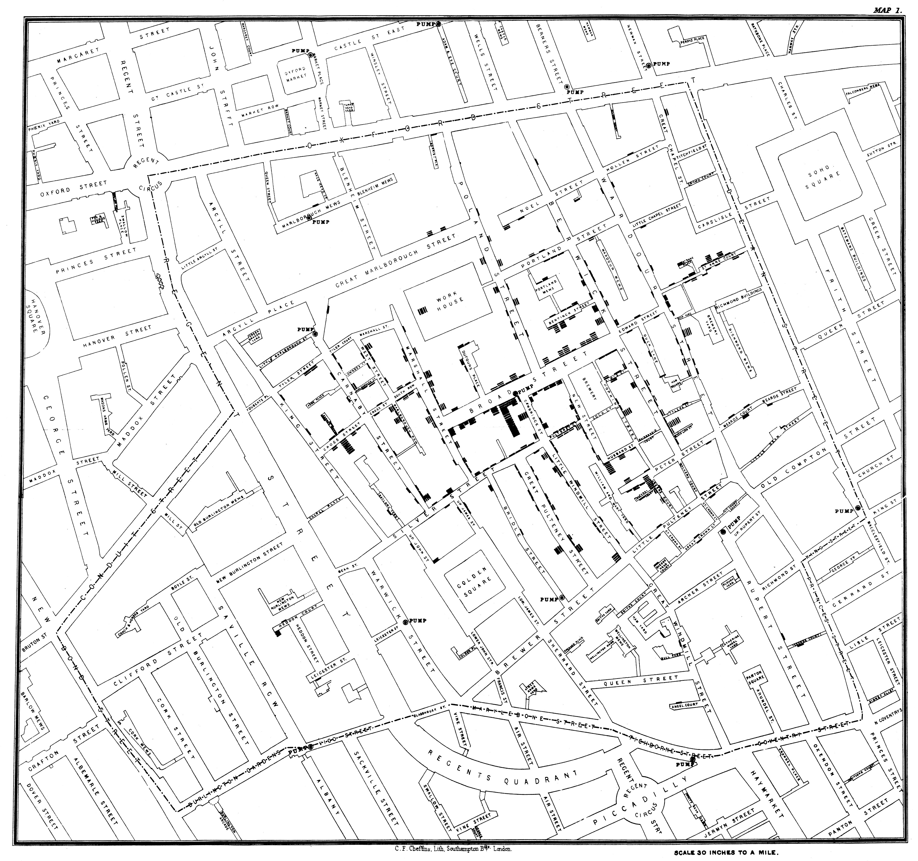
Map from Snow's 1855 second edition of On the Mode of Communication of Cholera, showing the 1854 outbreak. Public domain. The plate credits lithographer C. F. Cheffins.
Snow already had a waterborne explanation to investigate when he examined the Broad Street outbreak. Research by Howard Brody and colleagues examines the difference between that work and the later map-centered legend. Snow presented his first map in December 1854, after the September outbreak. The historical analysis, reproduced by UCLA
Snow's own account describes obtaining death records and asking about water use. Some people living nearer another pump nevertheless preferred Broad Street's water. The nearby workhouse had its own supplies; Snow reported five deaths among 535 inmates. He met the parish authorities on September 7, and the pump handle was removed the following day. His account also acknowledges that the outbreak was already declining. Snow's 1855 text
The drawing preserves a spatial arrangement of deaths. It does not contain every interview that connects a household to a water source. If you cover the prose and keep only the map, you remove much of the evidence needed to distinguish proximity from actual exposure.
Look for the workhouse label. The relatively open space within a building surrounded by marked streets invites a question. It does not answer that question by itself. Differences in population, water supply, record completeness or some other condition would require investigation beyond the shape of the blank area.
Here is a separate, invented example. Two streets each contain ten recorded events. One has fifty residents; the other has five hundred. Identical stacks of ten marks accurately show the counts. They do not show identical per-person rates. The denominators would produce twenty percent and two percent, respectively, if each event represents a different resident during the same defined period.
A dot map can also put an event at a home address even when the relevant contact happened at work. That may be the best available location, but the reader needs to know which location has been mapped. Place of residence, place of exposure and place of death can occupy different points.
Snow's streets remain compelling because they let us return to particular places rather than only to a citywide total. The plate can organize questions at a scale where doors and routes matter. Its fame becomes a hindrance only when the picture is asked to stand in for the entire investigation.
Read the bars, then read the account beside them. A map that helps explain an argument does not have to be the moment in which the argument was first conceived.
CHAPTER 14
The district changes its answer
Nine squares form a small invented town. Each square contains one hundred surveyed people. In the top row, ninety people in each square answer yes. In the middle row, ten do. In the bottom row, fifty do. Everyone answers the same question once; there are no missing responses in this exercise.
Across all nine squares, 450 of 900 people answer yes. The town's overall result is fifty percent.
Now organize the squares into three horizontal districts. The top district has ninety percent yes, the middle district ten percent and the bottom district fifty percent. A map using dark blue for high percentages will show a strong horizontal contrast.
Redraw the districts as three vertical columns, keeping every person and answer in the same square. Each column now contains ninety plus ten plus fifty yes responses: 150 out of 300, or fifty percent. The district map becomes uniform.
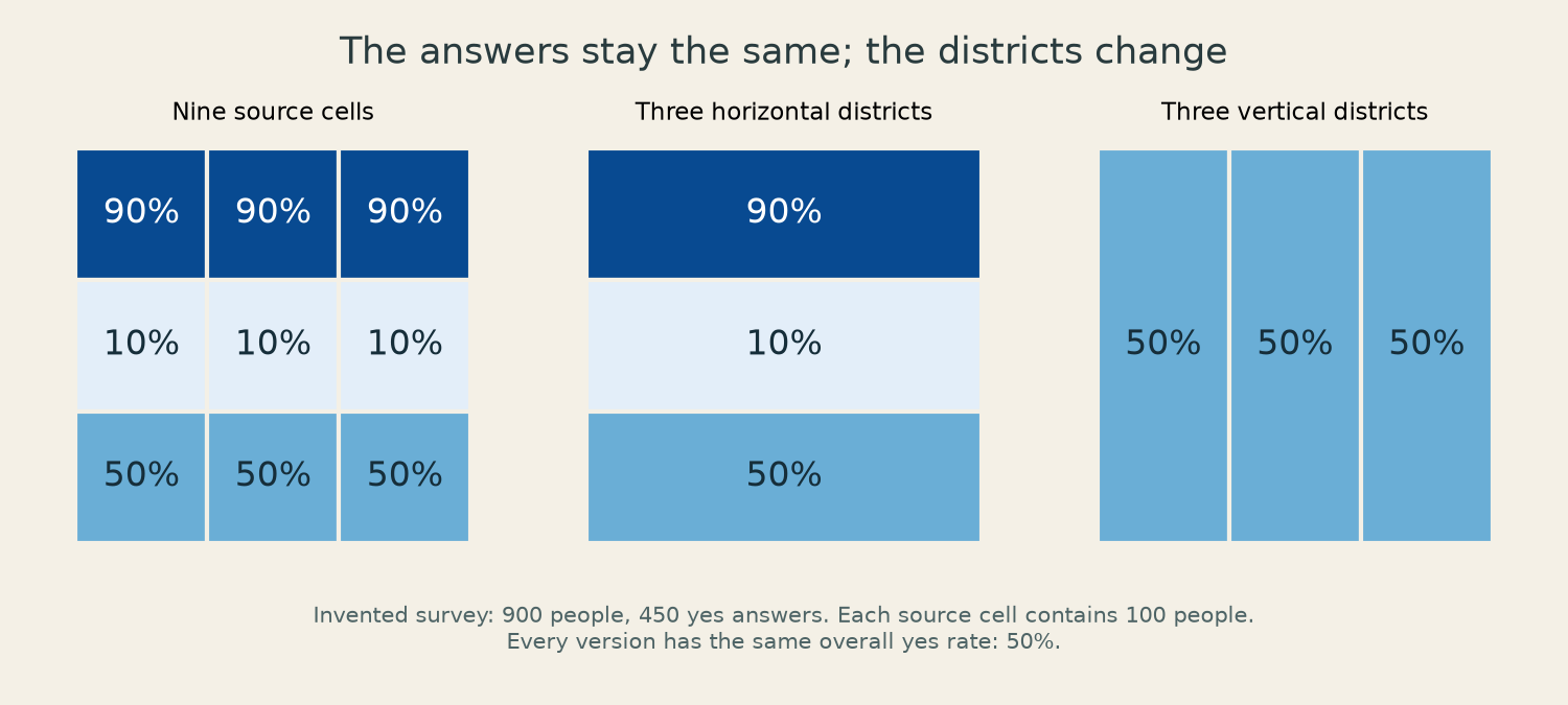
An invented survey. All cells contain 100 people. Both sets of districts contain the same 900 people and 450 yes responses. The underlying table is in the workbench.
Nothing has happened to public opinion between the two drawings. The units used to summarize it have changed. This belongs to the family of problems known as the modifiable areal unit problem: summaries can depend on the scale and arrangement of the areas used to group observations. Joan Nunes's account for the Cartographic and Geological Institute of Catalonia
You can reproduce the example with nine slips of paper. Write each square's population and yes count on its slip. Arrange them in three rows, add horizontally, then add vertically. Keep the slips fixed while drawing different boundaries around them. The disagreement between the district maps is now visible as arithmetic rather than as an accusation about color.
Suppose the map is used to decide where to hold a meeting. The row version directs attention to a concentrated difference that the column version hides. Suppose instead the administrative task is to allocate equal staff to the three existing column districts. Those boundaries may be relevant even though they obscure the smaller pattern. The right aggregation depends partly on the decision the map is supporting.
The example has equal populations to make the sums easy. With unequal populations, averaging the displayed percentages can create another error. A district of ten people at ninety percent and a district of ninety people at ten percent together contain eighteen yes responses out of one hundred. Their combined percentage is eighteen, not the simple average of fifty.
Neither exercise licenses a conclusion about an individual. A resident of the ninety-percent district could be among the ten who answered no. A town-level map tells you something about a collection of people, not the answer given by whichever person happens to live under your cursor.
For a real survey, additional questions return: who was asked, who answered, what date the responses describe, and how uncertain the estimates are. The nine squares set those complications aside openly. Their purpose is to show how much the boundary alone can do before any of those other difficulties arrive.
CHAPTER 15
Read the temperature scale
Charles Joseph Minard's map of the Russian campaign is dated November 20, 1869. A broad pale band moves toward Moscow; a black band returns. The returning band becomes painfully thin. Below it, a separate line records temperatures.
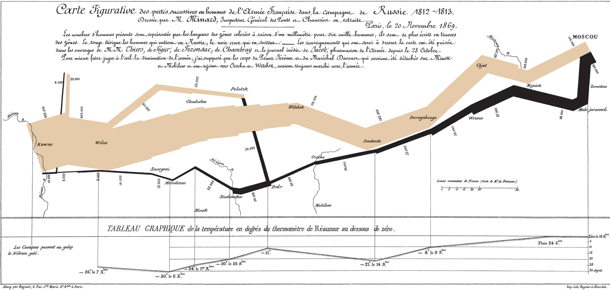
Charles Joseph Minard, 1869. Original French plate, public domain. Enlarge the image to read its numerical labels and explanatory text.
Begin at the bottom, where the heading identifies the thermometer scale as Réaumur. The −30 label does not mean −30°C. With the conventional freezing-to-boiling interval divided into eighty Réaumur degrees rather than one hundred Celsius degrees, −30°Ré corresponds to −37.5°C. The conversion is multiplication by five-fourths. NIST's temperature-scale history
This small reading task is a defense against remembering an image too well. The broad story of terrible cold is familiar enough that a reader may glide past the unit. Yet the unit changes the numerical statement. A remembered impression can survive while its measurement becomes wrong.
Now follow the pale band from the left. The printed numbers begin at 422,000 and reach 100,000 near Moscow. Much of the reduction shown by the map therefore precedes the return journey's coldest labelled temperatures. The temperature graph accompanies part of the campaign; it does not explain every change in width across the whole plate.
The bands also split and rejoin. Near the left side, narrow branches peel away from the main movement. Farther across, a returning branch joins the black band and increases its width. A band can widen because a group rejoins, without anyone having been created at the junction. Its width is a count attached to the flow represented there.
Minard's explanatory text gives a width rule of one millimeter for ten thousand men on the original drawing and states simplifying assumptions about detached corps. On a resized phone image, a measured millimeter no longer has that meaning. The printed count labels survive resizing more reliably than a physical ruler placed against the screen.
The narrowing does not assign a cause or fate to every person no longer in a band. Treating the difference between two widths as a count of people killed at that location would add a claim the graphic cannot establish. The map is powerful without being a complete accounting of each soldier.
Try covering the lower temperature panel. The shrinking and branching remain visible. Cover the bands instead, and the weather sequence remains, but its relationship to the movement becomes harder to see. The force of the design comes partly from placing the two views where the eye can connect them.
Those connections deserve to be examined rather than merely admired. Which dates appear? Where do the vertical guide lines land? Which movements are combined? Minard left explanatory writing above his striking drawing. A clean modern reproduction that cropped it away would make the page prettier at the cost of some of its instructions.
CHAPTER 16
The station that moved on paper
Harry Beck drew an early version of his London Underground diagram in 1931. The published pocket map appeared in 1933. English Heritage records an initial rejection and then a large public response: 850,000 copies in the first two months of publication. English Heritage on Beck
The diagram made room for a network by simplifying its geographical arrangement. A passenger needed to identify a line, count stations and recognize a place to change. Exact street-level positions could be less useful for those tasks than legible connections.
We can examine the trade with an invented six-station network. A red line runs Alder–Bridge–Court–Dock. A blue line runs Elm–Court–Field. Court is the only interchange. Draw the red line horizontally and the blue line vertically through Court. Every adjacent pair is easy to see.
Now move Elm far to the left of Alder on a geographical sketch, and place Field close to Dock. Bend the blue route so it still runs through Court. The diagram and sketch describe the same station connections, but the shortest-looking stroke on one no longer resembles the shortest-looking stroke on the other.
A passenger traveling from Alder to Elm uses two red-line links to Court, changes, and takes one blue-line link. The diagram makes that sequence plain. It does not tell us whether walking between Alder and Elm would be quicker, because their surface distance and the walking route have been abstracted away.
Give each red link a fictional travel time of three minutes, the Court–Elm link four minutes, and the interchange a five-minute walk. The in-vehicle time is ten minutes. Add the interchange and it becomes fifteen, before any initial waiting or wait for the blue service. A count of three links has not supplied a fifteen-minute estimate by itself.
A second map could print travel times beside links. A third could emphasize step-free access or exits. Adding every useful fact to one small pocket diagram would eventually obscure the connections that made the original easy to read. Separate views can serve different stages of the journey.
The six-station example is small enough to redraw from memory. Try producing a version in which no two station labels collide and Court's interchange is unmistakable. Then produce a version that places the stations exactly where your geographical sketch put them. Compare how much room each needs.
A diagram's departures from geography should be legible as a convention. A new user can otherwise mistake evenly spaced stations for equal travel times or nearby labels for nearby entrances. Familiarity supplies experienced riders with corrections that a visitor does not yet possess.
Beck's work is often encountered as a finished icon. The small exercise returns attention to the labor of arranging lines, names and junctions in limited space. A station can move on paper so that a passenger can find the correct connection. The design succeeds when that movement helps the intended journey and the reader knows what kind of distance the page has ceased to promise.
CHAPTER 17
The pale square has no answer
A map contains three districts. The first has a measured value of zero, the second a value of fifty, and the third has not been measured. If zero is white and missing data are also white, two different statements become the same patch of paper.
The first says an observation produced zero. The third says there is no observation to report. That difference can matter more than the precise shade assigned to fifty. It belongs in the legend, perhaps with a separate pattern for missing values, before the reader starts interpreting the spatial arrangement.
ColorBrewer's guidance distinguishes sequential, diverging and qualitative schemes. Sequential schemes use an ordered progression for ordered values. Diverging schemes emphasize departures on either side of a meaningful middle. Qualitative schemes distinguish categories without implying a low-to-high order. ColorBrewer's explanation
Imagine mapping the number of trees along each street. A progression from pale to dark can express increasing count. For a map of changes since a previous survey, zero change might deserve the middle of a diverging scheme, with losses on one side and gains on the other. For tree species, several distinct category colors may be more appropriate than suggesting that oak is numerically greater than birch.
The boundary between colors creates a second set of decisions. Consider five invented district values: 19, 20, 21, 49 and 50. A scheme with a boundary at twenty can give 19 and 20 different colors while giving 20 and 21 the same one. A boundary at fifty can make 49 and 50 look sharply different despite their one-unit separation.
The values have not acquired a jump at the color boundary. The display has grouped them. That can be helpful when a real threshold matters, but an arbitrary break should not quietly masquerade as one. A legend showing the ranges lets a reader recover the grouping decision.
There is a further distinction between a count and a rate. A dark street on the tree-count map could simply be much longer than a pale street. If the question concerns tree spacing, trees per kilometer may be closer to the intended quantity. If the question concerns the total number of trees needing inspection, the count may be exactly what is wanted.
Try making both legends before drawing either map. Write “number of trees” above one and “trees per kilometer of street” above the other. The labels force you to decide what the color will mean while the design is still easy to change.
The blue circles in the map room avoid most of these problems by all representing the same ground area and by reporting the numerical comparison in text. They still need contrast against the coastlines and background. A color that looks distinct on one screen may be less clear on another, and a reader may not distinguish the hues you expect.
A final check is to cover the title and read only the legend. Can you tell what was counted, what the units are, what the ranges mean and how missing information appears? If the legend cannot answer, the attractive patches have been asked to explain more than their design actually encodes.
CHAPTER 18
The shortest path has steps
Our invented neighborhood has four places: a station, a square, a garden gate and a library. Two possible routes connect the station to the library. Through the square, the distance is 300 meters followed by 200 meters. Through the garden gate, it is 400 meters followed by 250 meters.
A shortest-distance calculation chooses the square: 500 meters instead of 650. Now add a fact omitted from the first table. The square-to-library link is a flight of steps. For a traveler who needs a route without steps, that edge is unavailable. The garden route becomes the shorter of the permitted alternatives because it is the only one left in this small network.
This is not a defect in arithmetic. The first calculation answered a less specific question. The missing requirement was in the description of the journey and the links, before the routing algorithm began.
For a second version, keep both routes available but assign travel times. Suppose the square route takes twelve minutes because of a long crossing wait, while the garden route takes ten. The shortest-distance answer remains the square; the shortest-time answer becomes the garden. Distance and time are two different edge costs.
For a third version, the garden gate closes at six in the evening. A route that exists at five may be unavailable at seven. A static line drawing can show the gate without saying when it is open. The path's geometry survives the closure; its usefulness as an itinerary changes.
These cases are deliberately small enough to solve by addition. A real routing system must contend with many more edges and attributes. Community mapping projects such as OpenStreetMap provide ways to record accessibility-related properties, including wheelchair access, while related tags describe width, surface and incline. The presence of a path line alone does not assert that all those details have been surveyed. OpenStreetMap's wheelchair tag documentation
A map can make missing attributes especially hard to notice because the lines look equally finished. The unsurveyed garden path may be drawn with the same smooth stroke as the recently checked pavement. A blank cell in the data table has disappeared beneath a confident visual style.
For the invented neighborhood, add a “checked” column to the route table. Give the square-to-library steps a date of observation. Leave the garden gate's opening time unknown. The second route can still be a candidate, but the map should no longer present its availability as an established fact.
If you were making this map for a friend, you might write one plain note beside the gate: opening hours unconfirmed. That small sentence could matter more than a more detailed drawing of the garden.
The exercise also suggests a way to improve a familiar map without redesigning its appearance. Find the link whose missing information is most likely to change the chosen route. Check that fact and attach the result to the right place. Adding one verified step, width or opening time can improve a journey more than adding another hundred decorative points.
CHAPTER 19
The date in the margin
An old map may carry several dates. The landscape was observed at one time, the sheet compiled at another, and selected details revised later. A scan can have a recent upload date while depicting information gathered decades earlier. Searching for the newest-looking date on a web page is therefore a poor way to establish what year its roads describe.
The USGS topoView collection lets readers inspect historical topographic sheets and compare editions. The collection preserves changes in mapping as well as changes on the ground. A newer sheet can show a different symbol system or level of detail, so an apparent disappearance needs to be read with the editions' conventions in mind. USGS topoView
Take a hypothetical pair of town maps. A railway appears on a 1950 sheet and is absent from a 1980 sheet. Several explanations are possible. It may have closed and been removed. The later map may omit that class of feature. Its coverage may differ. The scan may have lost a layer or a margin that explains the revision. The visual difference is a good place to begin an inquiry, but it has not yet supplied the railway's closing date.
Now suppose an archival photograph dated 1965 shows the track lifted, and a local timetable gives the final passenger service in 1962. Those would answer different questions. The map's line could refer to the physical track, an active railway or a convention for a disused route. Before combining sources, decide what event you are trying to date.
This is why the three historical maps in this book carry captions that distinguish their subjects from their production. Snow's plate appeared in an 1855 book about an 1854 outbreak. Minard drew his campaign map in 1869 about events in 1812–1813. The al-Idrisi image is a much later reconstruction of medieval geography. Removing those distinctions would make all three easier to caption and harder to understand.
Digital maps have editions too, even when the interface conceals them. A coastline file downloaded today can have been compiled from older source material. A repository's latest revision date might concern a spelling correction rather than a new survey. The date of the package is not a universal date of observation for every feature within it.
The map-room workbench therefore records the exact source revision and keeps the file used to make the figures. That makes the published example repeatable. It does not make the coastline current for every place. A reader who reruns it should receive the same simplified drawing, including the same omissions.
Try keeping a miniature change log for a map of one block. On the first date, record the objects you actually checked. On a later date, update only the altered ones and preserve a note of the change. A newly painted crossing and a newly discovered old gate should not both become “built today” merely because they entered your drawing together.
The margin is where a map can admit its age, sources and unfinished work. Cropping it off removes some of the least decorative information and some of the most useful evidence.
CHAPTER 20
Draw the last two hundred meters
Make a map for someone visiting a place you know well. Begin where their existing directions are likely to stop being helpful: the station exit, the car park entrance, the junction where two paths resemble one another. End at the actual door they need.
Keep the task small enough to check on foot. You do not need to map the town. The last two hundred meters may contain the only turn that causes trouble.
On a first sheet, draw what you remember without consulting another map. Include the landmarks you use when giving directions. Then visit the route and compare the drawing with what is visible from a stranger's position. A building that is obvious from your usual approach may be hidden from theirs. A landmark you call “the old bakery” may have no surviving sign that allows them to identify it.
Choose the page's orientation after deciding where the reader begins. If the map is meant to be held while leaving a station, an exit-oriented drawing may reduce the first mental rotation. Include a north arrow if it helps connect this drawing to another source. The arrow should explain the arrangement, not force every task into the same layout.
Use the few labels needed to distinguish decisions. If there are three doors on a wall, “entrance” may be less helpful than identifying the middle one and the sign beside it. If a turn happens before a bridge, show which side of the bridge. A beautifully drawn river cannot repair an ambiguous instruction at the crossing.
Measure or otherwise check any distance you intend the reader to rely on, and state when a sketch is only approximate. For the simplest route, a sequence of landmarks may do more work than a finely ruled scale. Preserve the order in which the traveler encounters them.
Give the draft to someone who does not know the route. Let them describe what they would do, without your voice supplying the missing turn. If they hesitate, mark the place on the draft. Their hesitation identifies a design problem more precisely than asking whether they like the map.
Revise that point first. Perhaps the route needs one extra label. Perhaps two paths should be separated more clearly. Perhaps an attractive building outline can be removed to make room for the entrance. Keep the old draft so you can see which change resolved the ambiguity.
Add the date you checked the route. If access depends on a gate, include the hours you verified or say that they remain unknown. If the route has steps, put that information where someone choosing a route can use it, before arrival at the steps.
The finished drawing may be plain: a few lines, three names, one arrow and a door. Send it at the size your visitor will read, then open the same file on your own phone. Check that the labels have survived the reduction.
Save an editable copy. A shop will change its name; a gate may move; someone will approach from the other station exit. Leave yourself enough room to alter the map when the next visitor tells you where they got lost.
Sources & edition note
This is an AI-generated nonfiction edition based on linked sources. Kit Venn is a fictional editorial pen name. The prose, dates and numerical examples were checked for this edition on September 5, 2026.
The map room uses a sphere and a simplified public-domain Natural Earth coastline. It compares projection rules; it is not a survey or navigation chart. The harbor routes, survey town, height examples, station network and neighborhood are invented worked examples, not field observations.
The three historical illustrations are actual public-domain maps. Miller’s late-1920s reconstruction is distinguished from al-Idrisi’s 1154 work; Snow’s 1855 plate depicts the 1854 outbreak; Minard’s 1869 plate describes the 1812–1813 campaign. Full image credits and reproducible calculations accompany the map-room workbench.
Original diagrams and code are supplied with an MIT license; Natural Earth data and the historical maps retain their public-domain status. Open the interactive map room or download the EPUB for offline reading.
- Malys et al. · Why the Greenwich meridian moved (2015) ↗
2015 peer-reviewed analysis: Airy meridian, approximately 5.3 arcseconds/102 meters, local gravity and continuity of rotation measurements. The displacement is not explained by plate motion.
- Royal Museums Greenwich · Airy Transit Circle ↗
Royal Observatory instrument record; first observation January 4, 1851.
- Library of Congress · The Islamic World Map of 1154 ↗
Al-Idrisi’s 1154 commission for Roger II, seventy sections, source traditions and Miller’s later reconstruction.
- Aileen Buckley · When true north is not at the top (2012) ↗
Cartographer Aileen Buckley’s 2012 orientation example at the San Diego Convention Center.
- PROJ · Mercator ↗
Spherical and ellipsoidal Mercator formulas; the book implements the spherical version with equatorial scale 1.
- GeographicLib · Geodesics on an ellipsoid ↗
Geodesics on an ellipsoid. The book’s two fictional harbors deliberately use a simpler sphere and independently checked arithmetic.
- Šavrič, Patterson and Jenny · The Equal Earth map projection ↗
Šavrič, Patterson and Jenny: 2018 online paper, later 2019 journal issue; Equal Earth design, coefficients and equal-area property.
- PROJ · Equal Earth ↗
Independent cartographic implementation of Equal Earth used for numerical comparison.
- Natural Earth · 1:110 million coastlines ↗
Natural Earth small-scale coastline description. “110m” means 1:110 million, not 110 meters.
- Natural Earth · Public-domain data terms ↗
Public-domain data terms; no new license or permission required.
- USGS · US Topo Map Symbol Guide ↗
USGS symbol conventions and map-scale example 1:24,000, one inch 2,000 feet.
- RFC 7946 · The GeoJSON Format ↗
RFC 7946: GeoJSON coordinate order, longitude before latitude.
- Milbert and Smith · Converting GPS height (1996) ↗
Milbert and Smith’s 1996 NGS explanation of h = H + N and reference-system compatibility. Not a recommendation to use GEOID96 for a modern survey.
- NOAA · Magnetic declination ↗
NOAA explanation of magnetic declination, local field direction and temporal/spatial change.
- Ordnance Survey · Grid convergence and coordinates ↗
Ordnance Survey explains grid-to-true-north convergence and projected coordinates.
- NOAA/BGS · World Magnetic Model 2025 ↗
NOAA/BGS WMM2025 documentation, released December 2024, valid through 2029. Dated claim checked September 5, 2026.
- USGS · What is a topographic map? ↗
USGS explanation of contours and height reference; grade and profile examples are original calculations.
- Brody et al. · Map-making and myth-making in Broad Street ↗
Brody and colleagues’ 2000 historical analysis, with UCLA’s map history. Snow’s prior theory and December 1854 map presentation.
- John Snow · On the Mode of Communication of Cholera (1855) ↗
John Snow, On the Mode of Communication of Cholera, second edition 1855, pp. 38–55. Primary account of water-use inquiries, workhouse, September 7 meeting/September 8 handle removal and already-declining outbreak.
- Joan Nunes · Modifiable areal unit problem (2013) ↗
Joan Nunes, 2013, ICGC dictionary: modifiable areal unit problem, scale and zoning. The book’s nine-cell numbers and figures were independently constructed.
- NIST · History of temperature scales ↗
NIST historical account of temperature scales; conventional Réaumur interval 0–80 supports the book’s −30°Ré = −37.5°C conversion.
- English Heritage · Harry Beck ↗
English Heritage’s Beck biography: 1931 draft, 1933 publication and 850, 000 copies in its first two months.
- ColorBrewer · Types of color scheme ↗
ColorBrewer guidance on sequential, diverging and qualitative schemes. No palette artwork copied.
- OpenStreetMap · Wheelchair access tagging ↗
OpenStreetMap community tagging documentation for wheelchair access and related physical attributes; no claim that mapped paths are completely surveyed.
- USGS · topoView help and metadata ↗
USGS topoView historical maps, editions and metadata dates; source time is distinguished from scan/upload time.
- Natural Earth · Exact coastline revision ↗
Pinned file used here: 134 LineStrings, 5, 128 coordinate pairs. Preserved in the workbench.
- PROJ · Lambert cylindrical equal-area ↗
Independent reference for the third projection; standard parallel zero in this workbench.
- Miller reconstruction · Image record ↗
Public-domain reconstruction with transliterated names. Commons identifies its version as 1929; not the original 1154 manuscript.
- Snow map · Image record ↗
Public-domain scan. Its metadata’s 1854 book date is not followed; the cited second edition appeared 1855.
- Minard map · Image record ↗
Public-domain 1869 French plate, inspected directly. Réaumur units, troop-width legend and stated detached-corps assumptions.
- pyproj · PROJ interface ↗
Independent coordinate checks used pyproj 3.7.2, sphere radius 1 and the documented projection names.


